Library Web Components
WYSIWYG-Compatible Blocks
Accordion
Accordions are expandable containers that are great for breaking up content into smaller, easily read sections.
Each accordion has a title, configured in the block tab in the editor sidebar, which should let the user know what to expect when they click on the accordion. Each accordion also contains content; this can include anything that can go inside a WYSIWYG.
Link List
Link Lists have two style options: Button (one or two column) or Link (one column).
Button Style: One Column
Button Style: Two Columns
Link Style
Butler Directory
The Butler Directory block pulls information for faculty and staff from the directory by username. Simply list the usernames of each individual you wish to display, separated by a comma. This list can be automatically alphabetized, if desired.


Marketing and Communications
Kristi joined Butler University in 2013 and has served as a member of both the Enrollment Management and Marketing and Communication divisions. She was named Director of Enrollment Marketing in 2019 and led the creation of the new Enrollment Marketing team within the Marketing and Communications division. In her role, Kristi leads marketing and communication strategy efforts for prospective students at all levels of study.
Kristi and the Enrollment Marketing team act as the “bridge” between Marketing and Communications and Enrollment Management, and also work closely with the academic colleges, graduate programs, and Student Affairs. Kristi’s areas of expertise include student recruitment and student lifecycles, marketing and brand strategy, CRM marketing and Slate, and data analytics. Kristi has helped to revamp the University’s approach to prospective student communication and worked on a number of key enrollment marketing initiatives, including the nationally recognized #ButlerBound campaign and the University’s award-winning pet communication flow.
Kristi is a 2011 graduate of Indiana University Bloomington where she studied Journalism. She received her MBA in 2013 from WGU Indiana, where she also served on the University’s public relations team before joining Butler.
When away from the office, she enjoys spending time with her family (yes, cat included), listening to podcasts, and gardening.

Marketing and Communications
Evan Krauss, a 2016 College of Communication graduate and Strategic Communications Masters candidate, has been with the Butler Marketing & Communications office in one form or another since 2013. Starting as a volunteer handler of Butler Blue III and working his way through an internship his Senior year, Krauss is now Senior Marketing Manager and Handler/Dad of Butler Blue IV.
Full-Width Blocks
These blocks must be placed outside of a WYSIWYG. They should also not be placed inside accordions or design blocks, as they will not display correctly.
One Column: Two Buttons
This block allows for up to two buttons by default (up to three total), an optional heading, and a configurable background image with blue overlay.
Three Columns: Text and Links
This block allows for a heading, a description, and links arranged horizontally. Up to four links may be included, but this block generally looks best with just one or two links.
Two Column: Billboard
Allows for a headline, a brief overview, and up to twelve card items. Each card allows for an image, a headline, a description, and a link.


Two Column Cards
This block allows for a headline with two cards, each with a headline, image, and a link. The background design may be toggled off.
Title

Left Callout
Left Callout Link
Right Callout
Right Callout LinkTwo Column: Full-Width Image or Video
Allows for either a prominent image or video and Highlighted text. This block is always full-width. Includes a Kicker, a Headline, a Description, and up to four links.

Two Column: Header on Left; Text on Right
This block allows for a header on the left and text and media on the right.
Headline
Allows for one paragraph of body text. Can include images.

Two Column: Quote
This is a two column callout with a quote in one column and an image in the other. The layout can be flipped; the quote can be on the left and the image on the right, or vice versa. This block may contain multiple quotes, and it is often used with the layouts alternating, as illustrated below.
Kicker Text
Kicker Text
Two Column: Two Buttons
This block can display a heading with adjustable heading level, description, and up to two links. The links may be styled as callout text links or as buttons. A solid color background may also be added.
Without Background, Text Link Style
Without Background, Button Link Style
With Bright Blue Background, Text Link Style
With Bright Blue Background, Button Link Style
Events
This block pulls events from events.butler.edu into a feed and displays the first four alongside a link to view all applicable events. It can be set up to pull only events from a specific category or with a specific tag. If there are no applicable events to display, the block will automatically hide itself.
Full Width Video/Image
This component features a video or image that takes over the screen as the user scrolls. It also allows for up to two lines of large text for emphasis above the image/video.
Because this component has a large impact on a page, it should be used with caution and reserved for special circumstances.
Two Lines of Text
Headline Text

Gallery Carousel
Carousel allowing for up to 4 slides of content, each containing a background image, an optional cutout image, a card with kicker text, a headline, body, and up to one text button. Includes an optional blue overlay.


Gallery – Modal
An eye-catching and large-scale way to show off a number of Butler photos. It has space for a medium length headline and a CTA to draw users to open up the modal window to view photos and their captions.
Description Here


Quick Facts
Tiles with several patterned background options designed for displaying two to three basic stats and facts.
News
Pulls and displays stories from stories.butler.edu. Can be configured to pull only stories from a specific category or tagged with a specific tag.
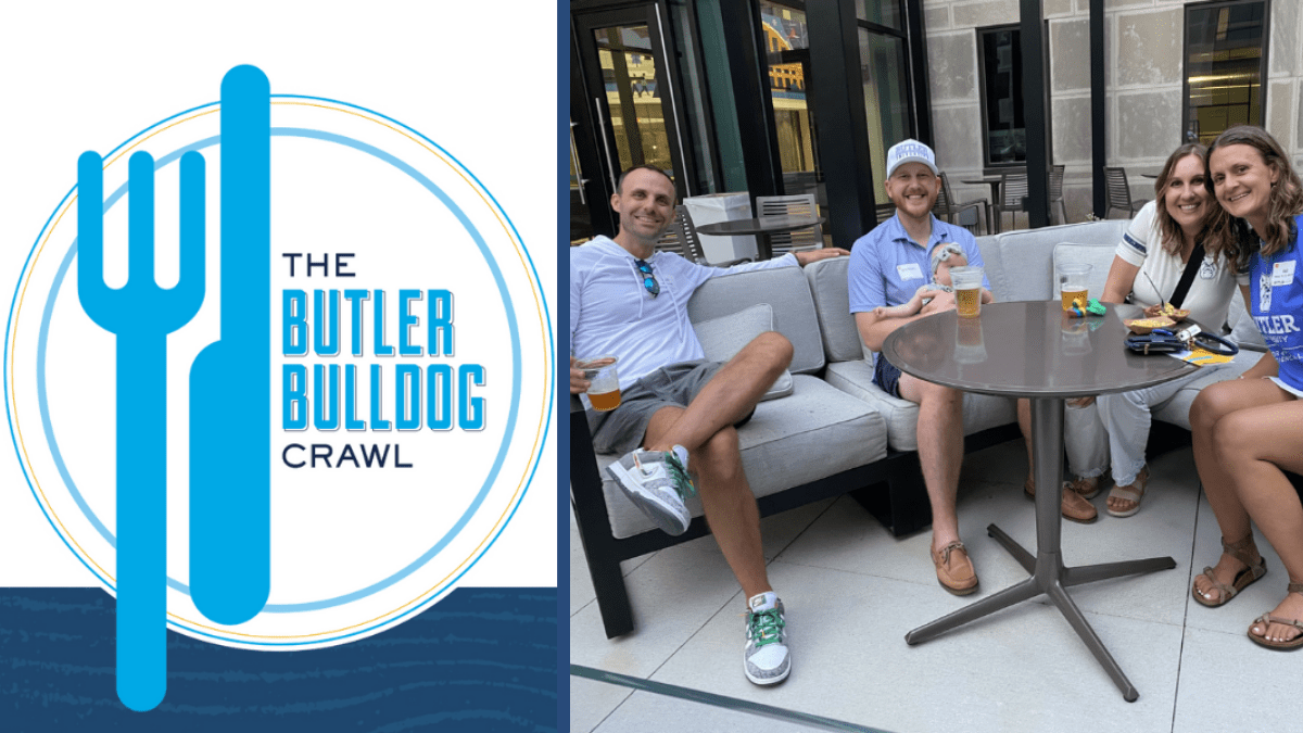
The annual Bulldog Crawl event hosted by the Central Indiana Alumni Community returns to campus on Friday, June 27, featuring many returning favorite vendors along with new vendor HotBox Pizza, which was founded in 2004 by Butler graduate Gabe Connell MBA ՚01. Since its inception in 2016, the Bulldog Crawl event has become a favorite […]
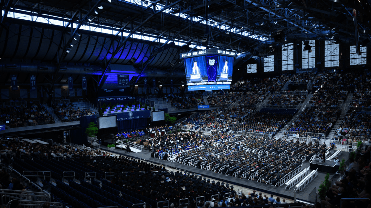
More than 1,500 graduates turned their tassels at Hinkle Fieldhouse on Friday, May 9, as Butler University celebrated the Class of 2025 during its annual Commencement ceremony. The event recognized 1,086 undergraduate and 479 graduate students, along with three individuals honored with the University’s highest recognition—an honorary degree. The evening was filled with heartfelt reflections, […]
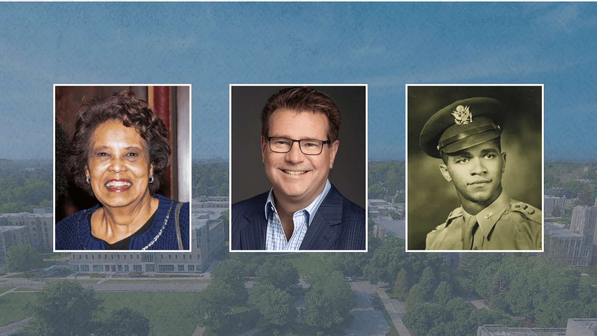
Butler University proudly announces that three exceptional individuals—Reverend Jean McAnulty Smith ’65, Bruce Arick, and Charles H. DeBow Jr. ’48, MS ’53—will receive honorary degrees during the Spring Commencement ceremony at Hinkle Fieldhouse on Friday, May 9, 2025, at 4:30 PM. Reverend Smith will receive an honorary Doctor of Humane Letters, while Arick and DeBow […]
Scrolling Ticker
Displays horizontally scrolling, looping text.
Scrolling Ticker
Scrolling Ticker
Scrolling Ticker
Scrolling Ticker
Scrolling Ticker
Scrolling Ticker
Scrolling Ticker
Scrolling Ticker
Scrolling Ticker
Scrolling Ticker
Footer Contact
A box with three columns designed for displaying contact information such as phone numbers, email addresses, and office locations. Can include social media icons.
Heroes
Heroes are to be used sparingly and are to be reserved for landing pages or other special cases. They replace the normal H1 on a page.
Hero – Alternate
Can feature an image or a soundless video. Blue overlay cannot be removed. Two layout options: Short and Tall.
Short Layout
Tall Layout
Hero – Standard
Includes a full-color background image. May include up to two hero button links.
Headline
Sub Headline
Description